Cikaba is a digital solution editor and its products allow companies to control security access of their various audiences. Every day, employees, visitors and contractors can be exposed to potential risks when entering a sensitive or dangerous site / area. With Cikaba solutions, basic safety instructions become accessible at any time, on site or remotely, using a simple smartphone or tablet.
We helped the start-up consolidate its brand platform in order to enhance the technology breakthrough of their products: A cloud service offering that is revolutionising a market that has historically been based on computer softwares.
Visual Identity
Logotype
We kept the original horizontal structure but we standardized the line and line weight across the brand pack in order to improve its harmony readability. The type face we chose spontaneously evokes the concepts of innovation, technology and modernity that describe Cikaba and start-ups in general.


Visual language
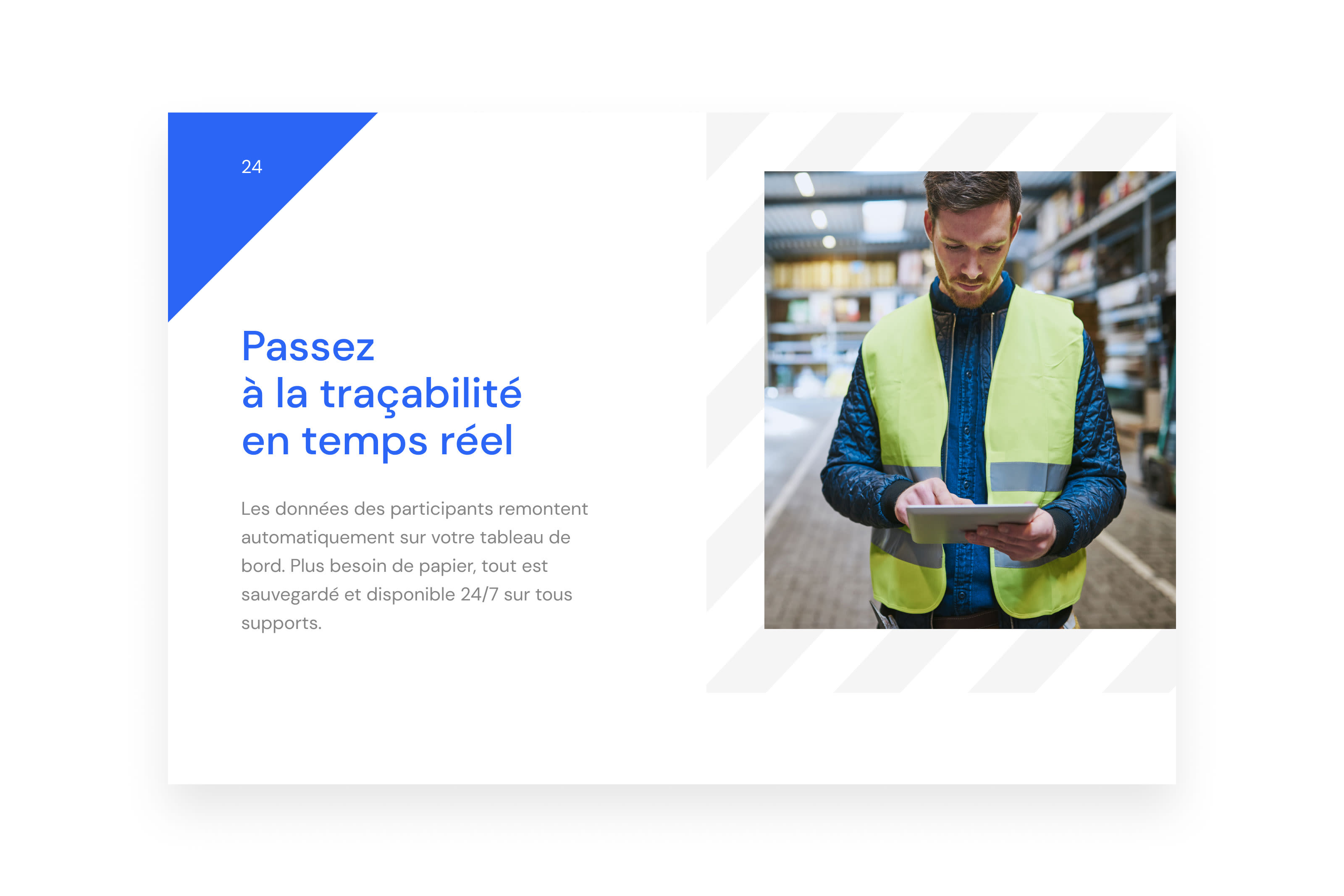
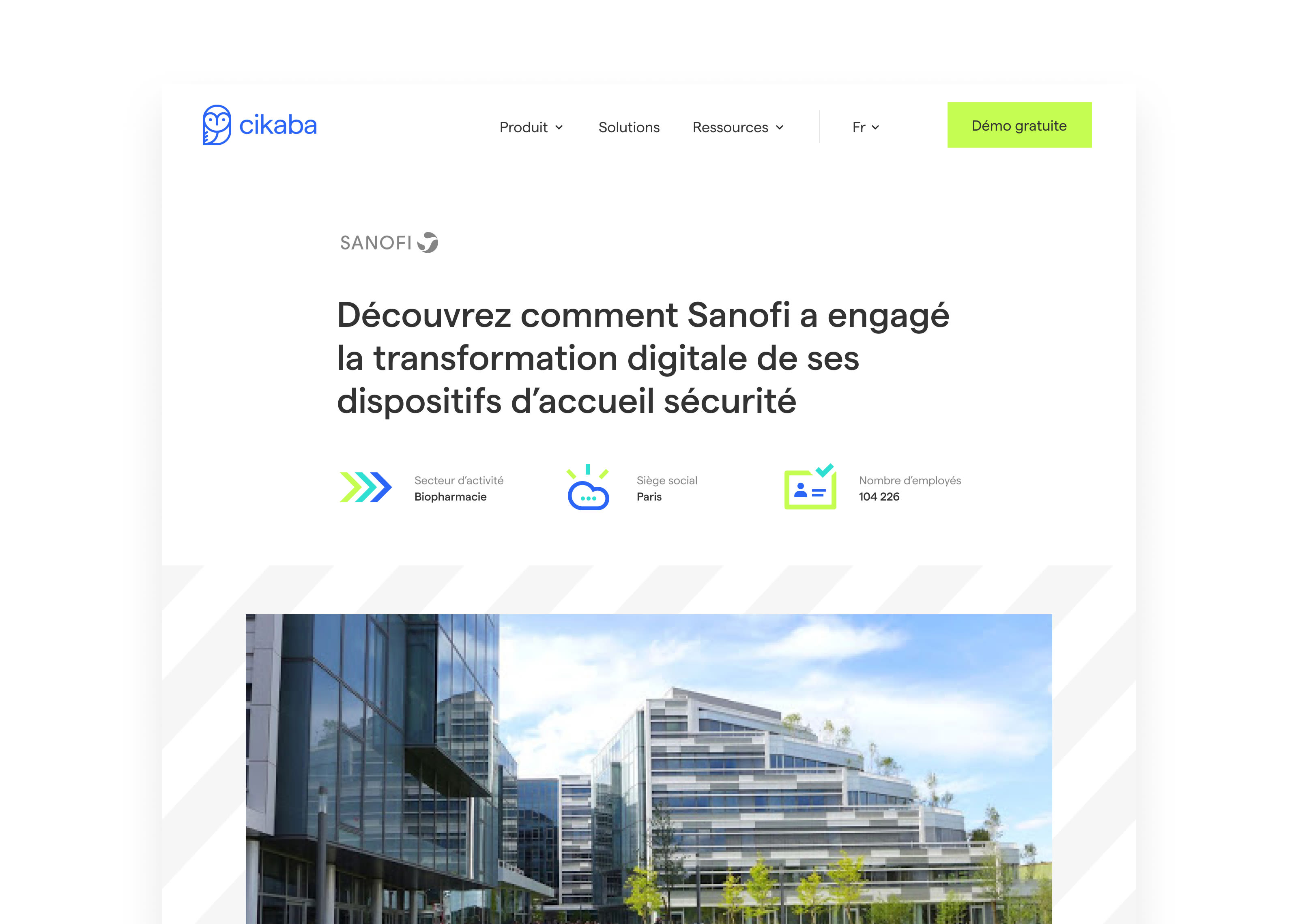
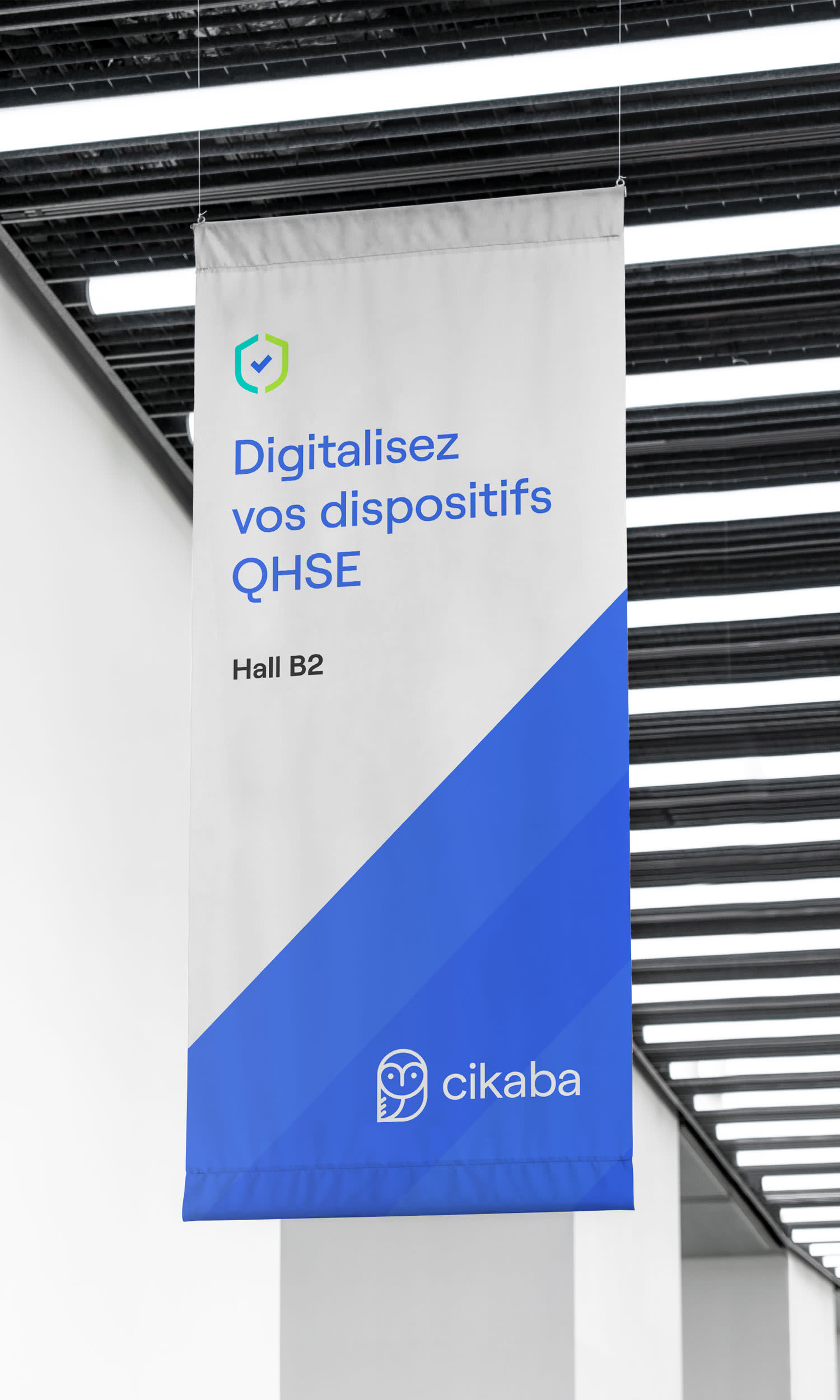
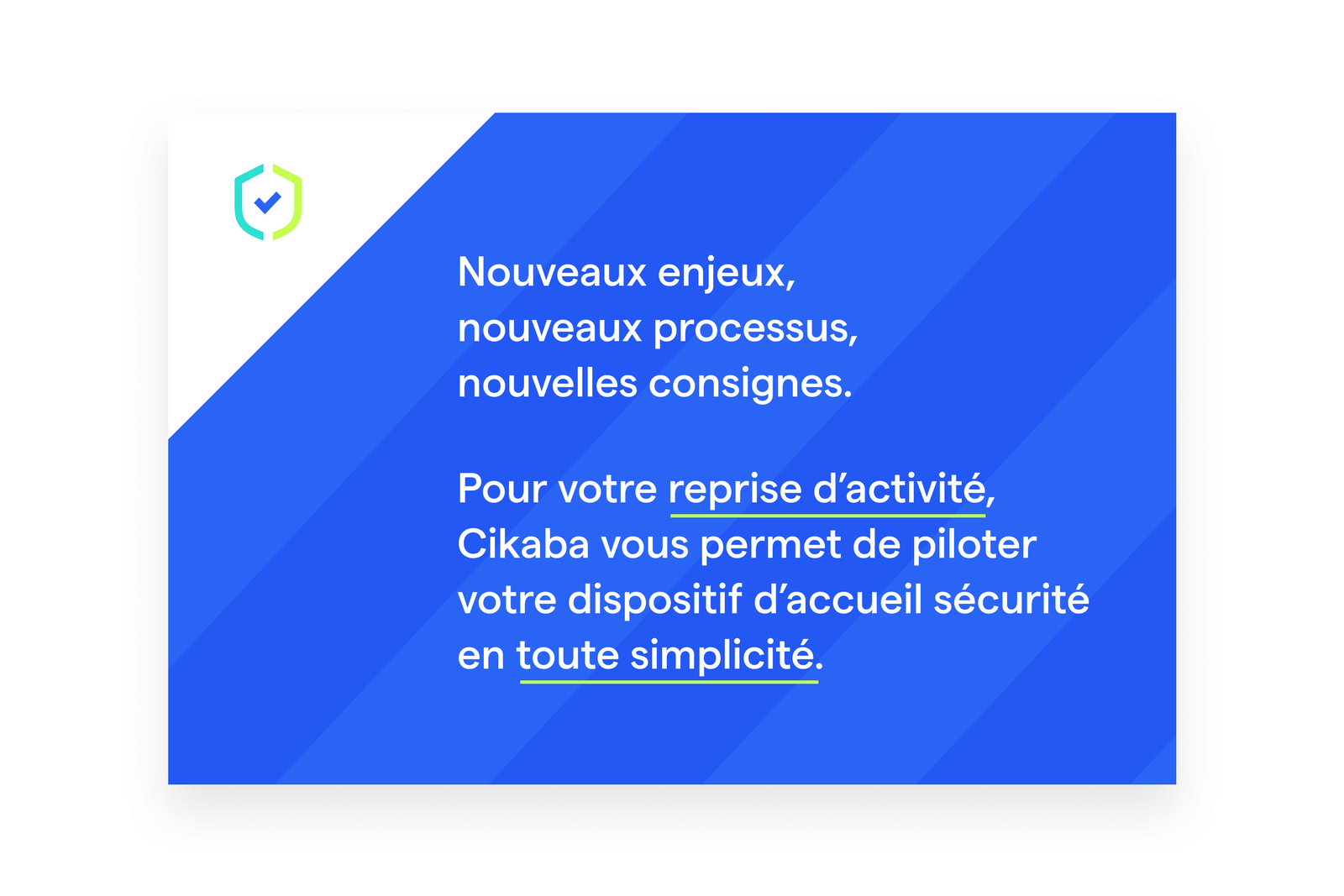
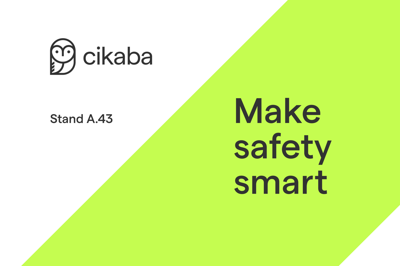
The visual language is then be adapted infinitely, based on 2 structural elements.

Iconography
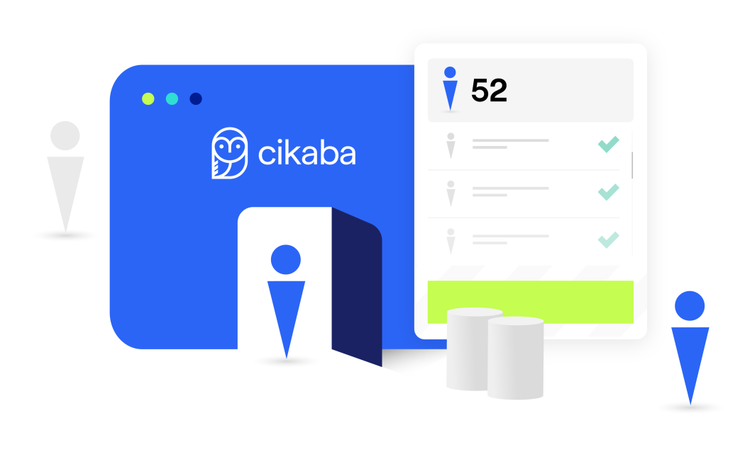
To illustrate the variety of contexts where Cikaba's solution can be used, we created an illustration system that allow for infinity combinations using different sceneries and characters.

Typography
Roobert - Displaay Type Foundry
